
![]()
Jigsaws
Sounds
Video
Custom Shows
vba code
NaviSlides
Games for teachers
Bullets
Triggers
Security
Flash Cards
Multiple Instances
PowerPoint 2007
Mail Merge
Random events
Animation
Hyperlinks
Set spellcheck language
Broken Bar Charts in PowerPoint
If you are plotting a graph where some values are a great deal larger than the others it can be difficult to interpret the lower values.
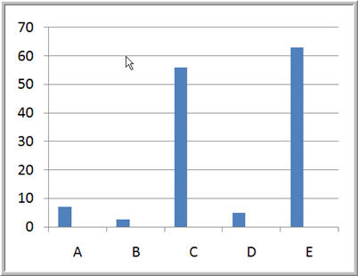
The lower values here are difficult to read. We need to create a chart that shows BOTH the upper and lower values - A broken bar like this:
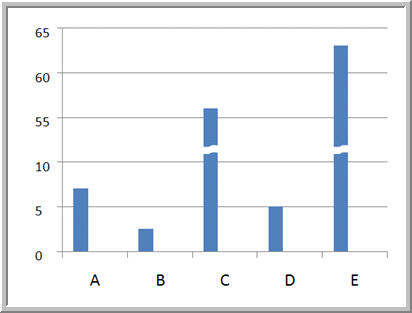
BUT .... PowerPoint cannot really create such a graph!
How to do it!
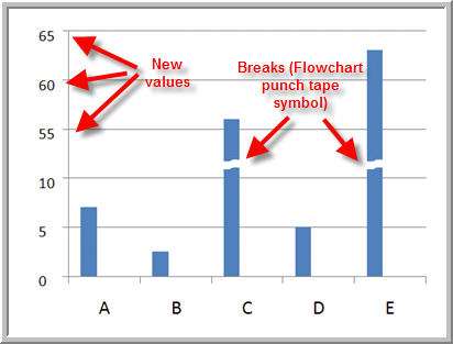
The first step is to adjust the larger values. We subtracted 40 from both of the higher values - you should choose a value that still shows the higher values as distinctly different. Re plot the graph. It looks much better and still indicates that there are two high values. Of course the actual higher values are incorrect.
Next format the value axis so that it does not show. In versions before 2007 un tick the value axis box in chart options > axes. In 2007 use Chart Tools > Layout > Axes.
Now re-lable the axis using textboxes. The 0, 5 and 10 values will be unchanged but after this add the value subtracted back on. We subtracted 40 so 15 becomes 55, 20 becomes 60 etc. Make sure that the font matches the chart and use the align tools for accuracy.
Lastly add in graphics set to background fill / no line to indicate the break.
Articles on your favourite sport
Free Microsoft PowerPoint Advice, help and tutorials, Template Links
This website is sponsored by Technology Trish Ltd
© Technology Trish 2007
Registered in England and Wales No.5780175
PowerPoint® is a registered trademark of the Microsoft Corporation